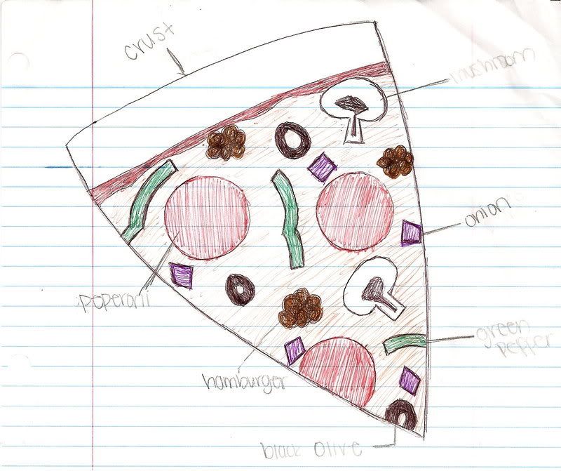
A pizza diagram. A map of pizza toppings. A guide to better understand a triangle shape piece of bread, cheese, and tomato sauce. This is one of my favorite diagrams. It is simple, easy to understand and color coded. I would have never thought of a piece of pizza as a diagram. Usually I just it and never stop to think that there part of a pizza that can be diagrammed and defined. Most of the other diagrams I see are in science textbooks and involve intense memorization. One I am currently working on is the plant cell. It has all sorts of parts and complex functions. Luckily a diagram just names the parts and not all the functions and purposes of each individual part. Whew. When I was a child I loved to assemble different lego figures and put things together like a barbie picnic set or a barbie Jacuzzi. My brother and I would split our allowance money and go to target to buy a lego kit. We would rush home and carefully empty the box of all the legos and open the instructions manual. My favorite part was matching the pieces and formations to those in the instruction booklet. Then as the different pieces and parts were put to together the entire lego spaceship would start looking like the flashy picture on the box. The end product would be carefully placed on the floor and admired for the next couple of days. Eventually the lego spaceship would crash in a lego star wars galactic war or pieces would be taken for another creation. Sometimes the diagram and instruction booklet would be found and the legos would be put back together again. Those were the good times--when diagrams made sense and they were not for memorizing and science oriented. (Unless, of course, the lego spaceship was modified into a spaceship/boat/car super hero vehicle.)
1 comment:
Being a student of science, such as yourself, I also have a different connotation of a diagram. The main one I remember from high school was that of the human body. My class and I had to color at least nine different complex diagrams of the human body such as ones showing muscles, nervous systems, skeletal features, etc. Those are the types of diagrams I quickly percieve. However, when it came to looking at this diagram of a pizza slice, I found it rather humorous and liberating. The cordinating colors add to the effect of the diagram. I wonder how different it would have been percieved if only the associative colors were switched up. How would green cheese for example look compared to white and yellow cheese?
Post a Comment